White vs. Green Night Vision: Why Grayscale Is the Better Choice
The green night vision look is iconic—movies, military footage, video games. A lot of first-time buyers ask for it specifically. But white phosphor grayscale is what high-end systems actually use, and there are concrete reasons why. Here's what the science says.

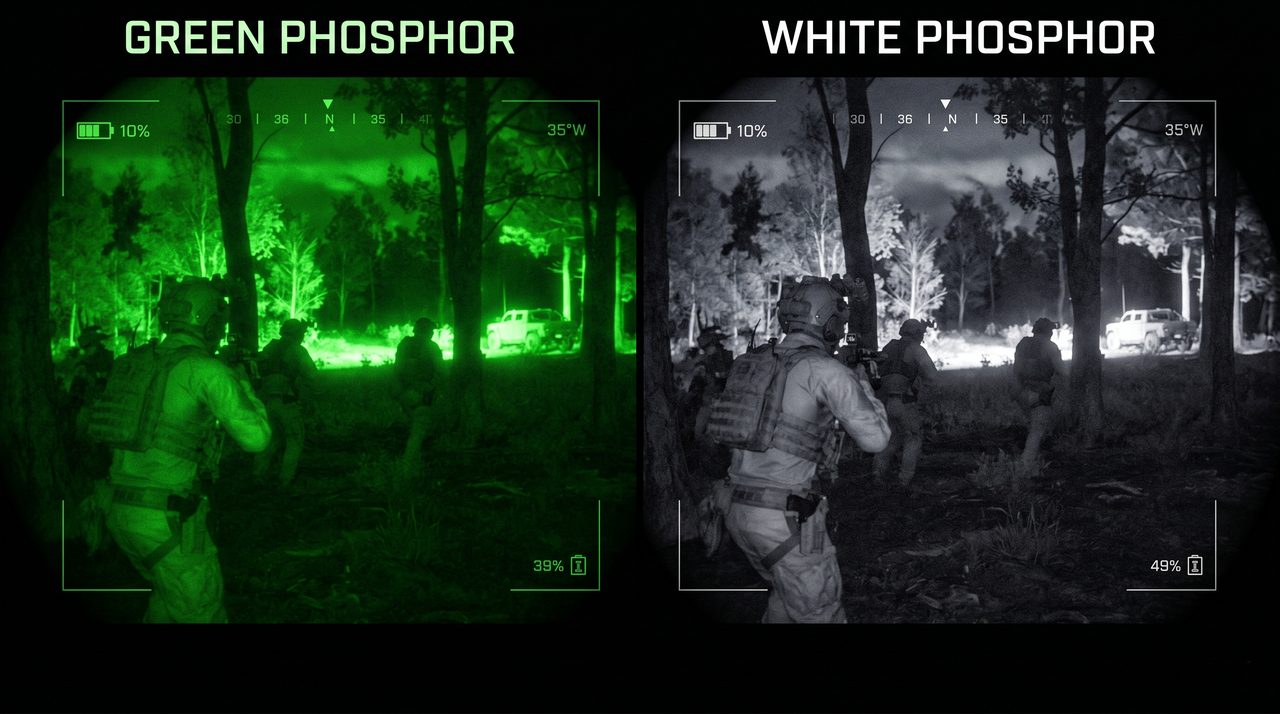
If you grew up watching military footage or action films, night vision means one thing: green. That green tint is so associated with the technology that many first-time buyers specifically ask for it. Some are disappointed when they discover that serious modern systems default to white grayscale instead.
They shouldn't be. White phosphor grayscale is not a cost-cutting choice or an aesthetic quirk—it is an upgrade, and once you understand why, you won't want to go back to green.
Why Night Vision Is Green in the First Place
The green color in traditional analog night vision is not a design choice. It is a byproduct of the physics.
In a Gen 2 or Gen 3 image intensifier tube, amplified electrons strike a phosphor screen to produce visible light. The standard phosphor used for decades is P43, which emits at a peak wavelength of approximately 543nm—squarely in the yellow-green part of the spectrum.
P43 was chosen for a specific reason: 543nm is close to the peak sensitivity of human scotopic vision—the visual system that operates at low light levels, dominated by rod photoreceptors rather than cones. Under dim conditions, the human eye is most sensitive to green wavelengths. A P43 phosphor screen therefore maximizes apparent brightness for the viewer in low-light conditions.
That was a sound engineering decision when analog tubes were the only option and maximizing apparent brightness mattered more than anything else. The green is not a feature. It is a consequence of optimizing for scotopic sensitivity with the phosphor chemistry available at the time.
White Phosphor: The Upgrade the Industry Moved To
As analog tube technology advanced, manufacturers developed P45 white phosphor—a phosphor that emits across the full visible spectrum rather than peaking in the yellow-green. The result is a grayscale image: dark areas render black, bright areas render white, with the full range of tones in between.
White phosphor is found in the most advanced analog systems, often marketed as "filmless" or high-end Gen 3 tubes. It commands a significant price premium over standard green phosphor equivalents. Operators who have used both overwhelmingly prefer white phosphor—not for aesthetics, but for performance. The reasons are well understood.
Why Your Brain Prefers Grayscale
The human visual system evolved processing scenes in natural light, which renders in full color or—at low light—in a achromatic grayscale as rod vision takes over. What it did not evolve to process is a monochromatic green image with no variation in hue.
When everything in a scene is the same green hue and only brightness varies, the brain has fewer visual cues to work with. Objects blend into backgrounds more easily. Textures are harder to read. Depth perception from luminance contrast is reduced because the narrow spectral bandwidth compresses the apparent tonal range.
A grayscale image—rendered in white phosphor or on a grayscale OLED display—gives the brain the full luminance range it is built to interpret. The result is measurably better performance on real visual tasks:
- Better contrast perception: the full black-to-white tonal range produces more distinct edges and boundaries between objects
- Improved texture discrimination: surfaces that look similar in green resolve into distinct textures in grayscale—foliage, clothing, ground cover, faces
- Faster object identification: operators identify targets and obstacles more quickly because the image is processed by the same visual pathways used in daylight
- Reduced eye strain over extended use: staring at a monochromatic green image for hours induces more fatigue than a grayscale image because the brain is continuously trying to extract depth and texture information from a format it was not optimized for
This is not subjective preference. Operators who have run both systems in the field consistently report that white phosphor grayscale produces a more comfortable, more readable image during extended use—which is exactly the condition that matters most.
In Digital Night Vision, There Is No Phosphor at All
Here is where digital has a structural advantage over analog: the color of the image is not determined by the chemistry of a phosphor screen. It is determined by the display.
The ASTRA-X10 uses an OLED micro-display. The sensor captures light across the 400–1100nm spectrum and outputs a digital signal. That signal is rendered on the OLED in whatever color mode the system is configured for. There is no physical constraint forcing a green output—the grayscale rendering is a deliberate choice, and it is the right one.
OLED displays have a further advantage for night vision: each pixel generates its own light and can be turned fully off for true blacks. This produces genuine black-to-white contrast rather than the gray-on-slightly-brighter-gray that LCD displays render. True blacks mean higher perceived contrast across the entire image—the dark regions in a scene look dark, which makes the bright regions appear brighter by comparison, which makes the image easier to read.
The combination of grayscale rendering and OLED true blacks produces an image that is not just better than green phosphor—it is better than white phosphor analog in this specific dimension, because the OLED can render a wider luminance range than any phosphor screen.
When Would You Want Green?
There are a few genuine reasons someone might prefer green:
- Familiarity: operators trained on green phosphor systems sometimes find green easier to read initially—a short adaptation period, not a performance advantage
- Interoperability: in mixed teams where some operators have green and some have white, a consistent color mode can reduce confusion during handoffs
- Low-light apparent brightness: P43 green phosphor's match to scotopic peak sensitivity does produce slightly higher apparent brightness under the dimmest possible conditions in analog systems—a marginal advantage that disappears once any IR illumination is used
None of these apply to most users. And in a digital system like the ASTRA-X10, the first two don't apply at all—the display can render any color mode equally well, and the sensor's sensitivity renders the third point irrelevant.
The Bottom Line
Green night vision looks like night vision because that is what mass media has shown for fifty years. White phosphor grayscale is what the operators who have used both actually choose when given the option—and they choose it for concrete reasons that hold up under scrutiny.
Better contrast. Better texture. Faster identification. Less eye strain. An image that your brain processes the same way it processes the real world.
If you are new to night vision and you want green because it looks tactical, that is understandable. Try grayscale for a week. You will not go back.